Responsive Resize
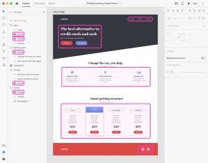
Most of the times your design will be used on a wide variety of screen sizes on mobile, tablet, and desktop which means that you have to consider how your design will look across multiple screen sizes.
Thanks to the Responsive Resize feature, XD automatically resizes your design by analyzing the objects from your design, the grouping structure and the overall layout.
Before you resize your work, it is important to group objects that are part of the same section (menus, buttons, carousels) to establish a relationships between them and give XD the information that it need to establish a hierarchy throughout your design.
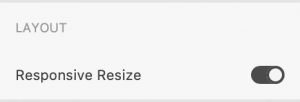 By default, responsive resize is turned off for artboards to make sure that you can adjust the size of your artbaord without affecting its content.
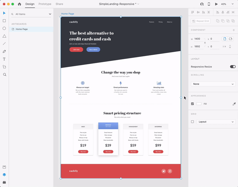
Select the artboard that you wish to resize and enable the Resposive Resize feature using the toggle button the Property inspector.
Move to the bounding box of your artboard and use it to resize our artboard.
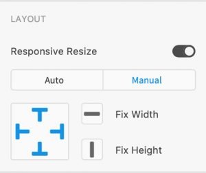
Results of a responsive resize action can be easily edited.
Select the object from your artboard that needs to be adjusted, change the Responsive Resize to Manual in the Property inspector and use one of the six buttons to make the changes that you need.
The main two buttons allow you to set a fixed/variable width/height for your object while the four “T” buttons allow you to set a fixed/variable left margin/top margin/right margin/bottom margin.