Component States & Hover State
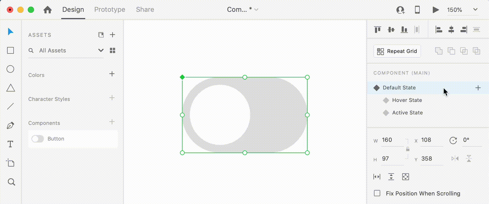
 Using the Component section in the Property inspector you can add states to saved components. You will always start with a Default State and you can add multiple state for one component.
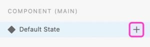
Click the “+” button next to the master component’s Default State in the Property Inspector, and select:
New State to show variations of a Component such as a disabled or clicked version.
Hover State to change the appearance when you hover over the Component in your Prototype. You can learn more about prototyping in the dedicated page.
Once added, component states can be easily edited. Switch between states in the Property inspector, select the one that you need to edit and make the changes.
Prototyping Component States
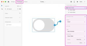
In Prototype mode you can animate the Hover and Tap interactions between components states. Wiring component states interactions is a real time saver as you don’t need separate artoards because you’re setting a state as a destination instead of an artboard. You can learn more about prototyping on the dedicated chapter.
We’ll use this toggle button to exemplify prototyping for component states.
Select your component and switch to Prototype mode. Select Hover as the trigger, set the interaction to Auto-Animate and for the Destination select the component state that you want to show up when you hover over the component.
You can apply more than one interaction for the same component state. For this example, you can also apply an interaction with a Tap trigger that gets you to the Active state of the toggle button.
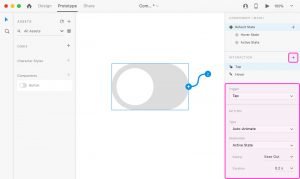
Once you’re done you can click the Preview button and check the animation of your component.

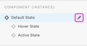
Editing Components States
 Component states can only be added or removed when you have the Master Component selected.
To easily get to the master component, right click on one of your component instances and go to Edit Main Component or select that component instance and click the Edit Main Component button from the Property inspector.
To remove a component state, right click on it and go to Delete. To rename a component state, double click the existing name and then type in the new one.
Remove, add or edit component states of the Master component and the other instances of the component will inherit the changes. Component instances with an active state that you remove from the Master component will switch to the default state.
All prototyping settings applied to a Master component state are automatically applied to other instances of the component. When you wire a component to a specific state/artboard, the other instances of of the component from your artboard will inherit the same settings.
Editing the state in a component instance will not affect the master component or the other component instances. XD marks that change as an override and keeps it as it is even if you return to the Master Component and change its appearance. To bring a component instance to the default state, right click on it and go to Reset to Main State.